Kaboom

Web design and marketing design for the fast-paced, cutthroat world of NYC theater. Godspeed.

Web design and marketing design for the fast-paced, cutthroat world of NYC theater. Godspeed.

Project type: Creative, Web Design

Role: Art Director

Primary Stakeholders: Account Directors, Executive Creative Director, Kaboom Account team
Primary Stakeholders: Automotive VP of UX, SVP Automotive Product and Technology, SiriusXM CEO

Deliverables: Commercials, Web Design,

Deliverables: Journey maps, flowcharts, IA charts, service blueprints, wireframes, high fi prototype

Introduction

Kaboom is a different kind of bathroom cleaner. Instead of heavily leaning on efficacy claims or some breakthrough scientific-sounding mumbo jumbo, Kaboom just wants to make cleaning more enjoyable. Everything from its zany color palette to its comic-inspired word mark is intended to lessen bathroom cleaning as a chore and elevate bathroom cleaning as a key to a happier life. Unfortunately, their digital presence was lackluster at best. That's where yours truly stepped in.

The Identity

At the same time that the object inventory was being assembled, my half of the team worked on creating wires and flow charts for the processes that would define the majority of the user experience within the current IA. With these we were able to pinpoint weak points in our interactions in addition to collecting open questions for dev and products teams. 

Click to read more

The first step was to create a campaign that would communicate how cleaning with Kaboom is "oddly satisfying," and then designing a zany identity to go with it.

The Campaign

To exhibit just how oddly satisfying Kaboom is we decided to create a bunch of videos where we conduct "experiments" showing how the everyday moments that we inexplicably know and love (eg. popping bubble wrap) makes your brain reacts. Then we sprinkled these videos all over Facebook to the delight of millions.

At the same time that the object inventory was being assembled, my half of the team worked on creating wires and flow charts for the processes that would define the majority of the user experience within the current IA. With these we were able to pinpoint weak points in our interactions in addition to collecting open questions for dev and products teams. 

Click to read more

The Website

At the same time that the object inventory was being assembled, my half of the team worked on creating wires and flow charts for the processes that would define the majority of the user experience within the current IA. With these we were able to pinpoint weak points in our interactions in addition to collecting open questions for dev and products teams. 

Click to read more

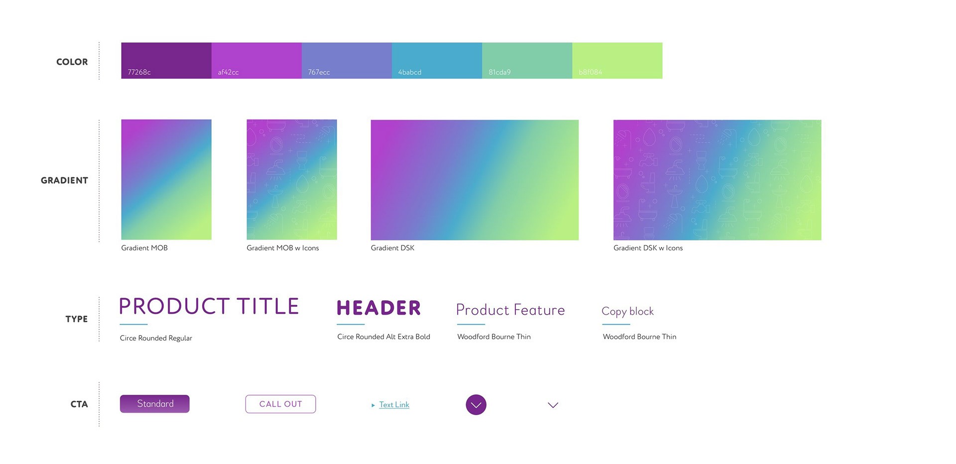
To accompany our new campaign, we were tasked with giving Kaboom's desktop and mobile sites a facelift. Their existing site was overly complicated, non-responsive and exhibited a poor hierarchy of information. The above style sheet gives a peek into the process we used to design a new digital presence for Kaboom that was simplified but also retained their fun brand colors and bubbly typography.

it’s interesting. The value in consolidation of content, easy access, giving me more content options with radio and music subscriptions. It’s nice to have that all consolidated.

~Brian

We learn to adapt and utilize stuff, and you don’t know until you know. If new vehicles have this, after six months you're clicked.

~Rick

I think it gets to the concept of having an all in one. I'm positive on the whole experience, but the biggest detail we still don’tknow about yet is the cost…

~John