SiriusXM Next Gen 2026
A full platform relaunch that will showcase a brand new, auto-optimized interface with an expanded content offering, plus seamless integration with our mobile companion app.
A full platform relaunch that will showcase a brand new, auto-optimized interface with an expanded content offering, plus seamless integration with our mobile companion app.
Project type: Automotive UX
Role: Lead Designer-Discovery & Recommendations
Primary Stakeholders: VP of Product Experience, SVP Automotive Product, SiriusXM COO, SiriusXM CEO
Primary Stakeholders: Automotive VP of UX, SVP Automotive Product and Technology, SiriusXM CEO
Deliverables: Journey maps, IA diagrams, conceptual designs, high fi designs, dev specs, design library
Deliverables: Journey maps, flowcharts, IA charts, service blueprints, wireframes, high fi prototype




Objective
Build a robust, next-gen automotive platform that utilizes the recently overhauled backend systems providing the ability to scale quickly, efficiently, and meet ever changing market demands. This platform's advanced capabilities will engage listeners with a highly personalized experience, more control, and easier access to the unique SiriusXM content and features that our listeners love, both in & out of the car.
Acceptance Criteria
Research
Bring together a wealth of learnings to build the foundation that will guide feature development
Conceptualize
Prioritize features and turn them into conceptual designs that will be used for future validation
Foundation
Define feature behavior in designs that will serve as the basis for engineering our platform
Design System
Integrate with the mobile and in-home design system to turn foundations into a robust library of building blocks
Foundational Research
Our work was grounded in a broad body of automotive UX research rather than a single foundational study. The work combined analysis of prior studies with targeted research into in-car listening, discovery, personalization, navigation, playback, metadata, saved content, profiles, voice, and cross-device behavior. Some of the more salient core principles include:
Familiarity and speed
Drivers want immediate access to habitual, recently played, and favorite content with minimal interaction–ideally within 1 to 2 taps
Easy pivot opportunities
Now Playing should enable quick, relevant transitions to related content, favorites, or other listening paths rather than forcing users into unnecessary drill-down browsing
Keep it safe!
The research repeatedly emphasized fewer clicks, limited scrolling, concise metadata, and interfaces appropriate for driving.
Low effort, contextual discovery
Users are open to discovery, but the right balance ranges from familiar to adventurous depending on the listener, content type, and driving context.
Enable deferred engagement
Users want to explore without losing their current session, making favorites, presets, and “save for later” mechanisms important
Familiarity and speed
Drivers want immediate access to habitual, recently played, and favorite content with minimal interaction–ideally within 1 to 2 taps
Low effort, contextual discovery
Users are open to discovery, but the right balance ranges from familiar to adventurous depending on the listener, content type, and driving context.
Easy pivot opportunities
Now Playing should enable quick, relevant transitions to related content, favorites, or other listening paths rather than forcing users into unnecessary drill-down browsing
Enable deferred engagement
Users want to explore without losing their current session, making favorites, presets, and “save for later” mechanisms important
Keep it safe!
The research repeatedly emphasized fewer clicks, limited scrolling, concise metadata, and interfaces appropriate for driving.
How can we maximize personalization, control, and engagement to satisfy the user while balancing the business goals of increasing discovery and introducing new formats like ad-supported tiers AND maintain our automotive safety principles?
How can we maximize personalization, control, and engagement to satisfy the user while balancing the business goals of increasing discovery and introducing new formats like ad-supported tiers AND maintain our automotive safety principles?
Foundational Workshop
Team members from Automotive UX, Product, Research, Streaming, Engineering, and program teams came together to ground Helios in user needs, identify chronic product problems, build empathy for younger listeners, and generate inputs for roadmap prioritization. We went through heuristic analyses, readouts on chronic problems and listener needs, as well as various mapping exercises that helped inform product feature prioritization.
Team members from Automotive UX, Product, Research, Streaming, Engineering, and program teams came together to ground Helios in user needs, identify chronic product problems, build empathy for younger listeners, and generate inputs for roadmap prioritization. We went through heuristic analyses, readouts on chronic problems and listener needs, as well as various mapping exercises that helped inform product feature prioritization.
Click to read more


Prioritizing Features
Features proposed by product owners were placed on an effort/impact matrix. The group challenged and normalized scores as features were mapped; T-shirt-size estimates contributed to the complexity total.


Features proposed by product owners were placed on an effort/impact matrix. The group challenged and normalized scores as features were mapped; T-shirt-size estimates contributed to the complexity total.
Click to read more
Conceptual Design Document
Post-workshop, we conducted an exhaustive amount of wireframe-level design work to satisfy the feature prioritization. The various program areas of the experience were divided amongst three UX designers, the subjects being Browse/Discovery, Audio Player/Channels, and Settings/Messaging/Profiles. Primitive designs and user flows were created and presented to our product counterparts as we as UX/Automotive product leadership.
Click to read more
Post-workshop, we conducted an exhaustive amount of wireframe-level design work to satisfy the feature prioritization. The various program areas of the experience were divided amongst three UX designers, the subjects being Browse/Discovery, Audio Player/Channels, and Settings/Messaging/Profiles. Primitive designs and user flows were created and presented to our product counterparts as we as UX/Automotive product leadership.




Key Features

Browse 'Sets'
Content is delivered in a mix of dynamic and curated groupings or 'sets,' increasing personalization, trust, and limited, deeper discovery

Channel List
Focused on linear browsing by channel number, the channel list brings a 'classic' radio paradigm into the 21st century

Now Playing Overlay
Changing the IA to include Now Playing as an overlay means it can be accessed from just about any browsing path within the app

Advanced Reccoes
Relevant, trustworthy, and dynamic recommendations that grow with the user; powered by a new stack of CMS delivery, MLI models, and listening data.

Go Deeper
Destination pages for artists, hosts, podcasts, teams, and genres allow users to narrow the focus of their explorations to entities of interest

Sidebar
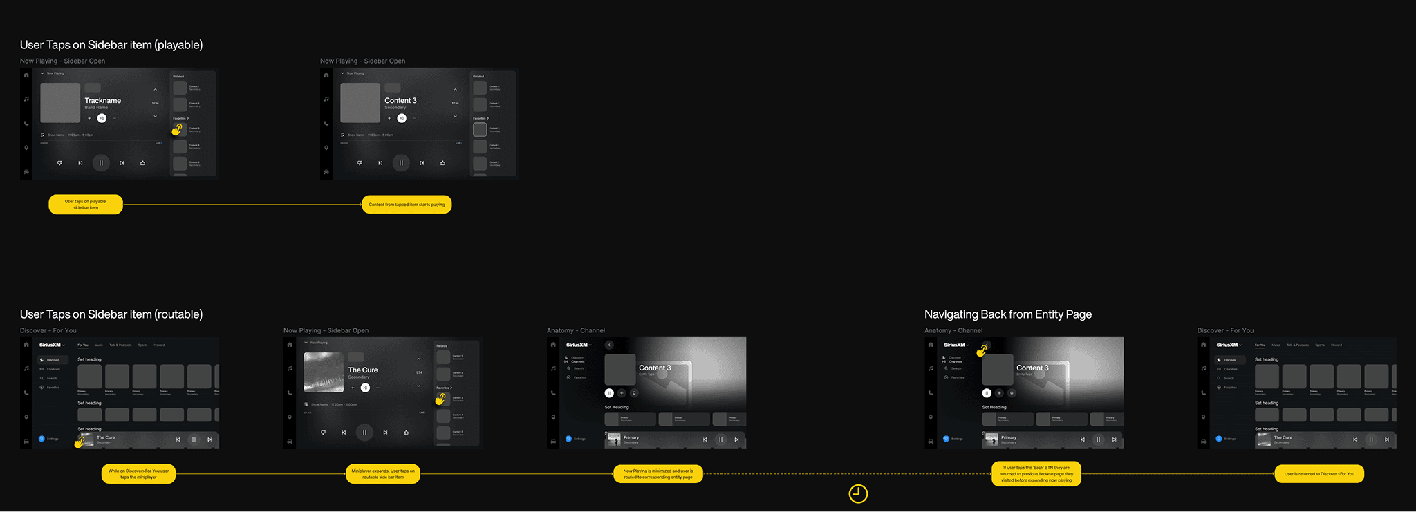
A collapsible panel on the Now Playing overlay that allows for quick pivots and access to favorited content
Concept Testing
The UX research team conducted concept testing on a weekly sprint cadence for a period of a few months to cover all of our program areas and respective feature flows that we were designing. The body of learnings was quite extensive but a few stand outs are as follows:

'For You' Page
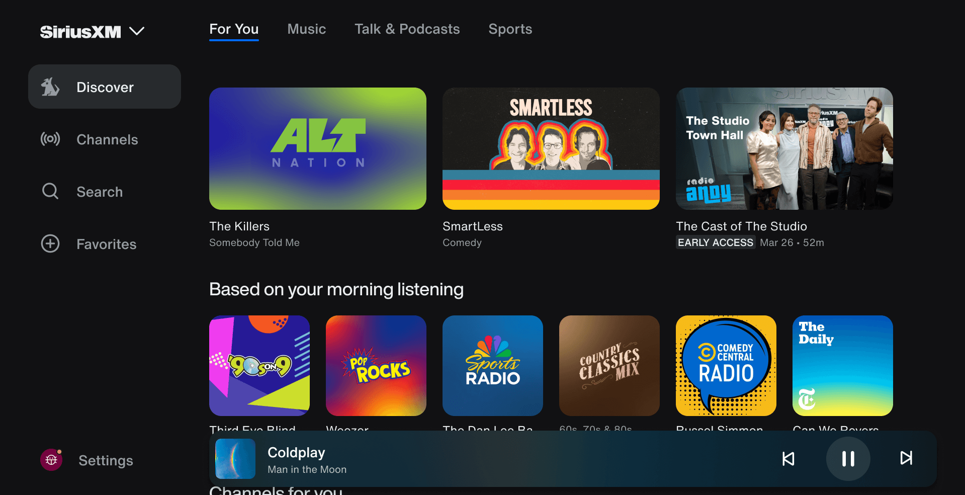
Users liked it when it behaved as a highly personalized home/dashboard, not as a general browse surface. They wanted Favorites, recents, and algorithmic recommendations there, and said they’d usually make a quick choice from familiar content rather than scroll deeply

Listening History
Most participants did not need very deep history; more than a month was usually unnecessary, and history was mainly valued for finding content or managing personalization/privacy. This function was determined to be better suited for mobile.

Channel List
Users appreciated the channels list for its linear, reccomendation-free browsing method as well as easy access from the core nav. They did not that they also wanted a quick way to 'flip' channels up/down, hence the addition of the radio dial in the now playing overlay

Now Playing
The full-screen Now Playing flow tested well because participants saw it as simple, clean, well-spaced, and less distracting while driving; with users appreciating its focus on what's currently playing. A few users found the skip buttons on live content confusing since they weren't aware they could perform those actions on that type of content.
'For You' Page
Users liked it when it behaved as a highly personalized home/dashboard, not as a general browse surface. They wanted Favorites, recents, and algorithmic recommendations there, and said they’d usually make a quick choice from familiar content rather than scroll deeply
Channel List
Users appreciated the channels list for its linear, reccomendation-free browsing method as well as easy access from the core nav. They did not that they also wanted a quick way to 'flip' channels up/down, hence the addition of the radio dial in the now playing overlay
Listening History
Most participants did not need very deep history; more than a month was usually unnecessary, and history was mainly valued for finding content or managing personalization/privacy. This function was determined to be better suited for mobile.
Now Playing
The full-screen Now Playing flow tested well because participants saw it as simple, clean, well-spaced, and less distracting while driving; with users appreciating its focus on what's currently playing. A few users found the skip buttons on live content confusing since they weren't aware they could perform those actions on that type of content.
'For You' Page
Users liked it when it behaved as a highly personalized home/dashboard, not as a general browse surface. They wanted Favorites, recents, and algorithmic recommendations there, and said they’d usually make a quick choice from familiar content rather than scroll deeply
Channel List
Users appreciated the channels list for its linear, reccomendation-free browsing method as well as easy access from the core nav. They did not that they also wanted a quick way to 'flip' channels up/down, hence the addition of the radio dial in the now playing overlay
Listening History
Most participants did not need very deep history; more than a month was usually unnecessary, and history was mainly valued for finding content or managing personalization/privacy. This function was determined to be better suited for mobile.
Now Playing
The full-screen Now Playing flow tested well because participants saw it as simple, clean, well-spaced, and less distracting while driving; with users appreciating its focus on what's currently playing. A few users found the skip buttons on live content confusing since they weren't aware they could perform those actions on that type of content.
Feature Spec Documentation
At the same time that the object inventory was being assembled, my half of the team worked on creating wires and flow charts for the processes that would define the majority of the user experience within the current IA. With these we were able to pinpoint weak points in our interactions in addition to collecting open questions for dev and products teams.
Click to read more
Following the concept testing we were able to implement user feedback and create polished, feature spec designs. These would be integral in communicating feature behavior to the solution architects and engineers who joined our program area tiger teams. From these designs, the engineers were able to size features and successfully build out their timelines


Design Library/Dev Specs
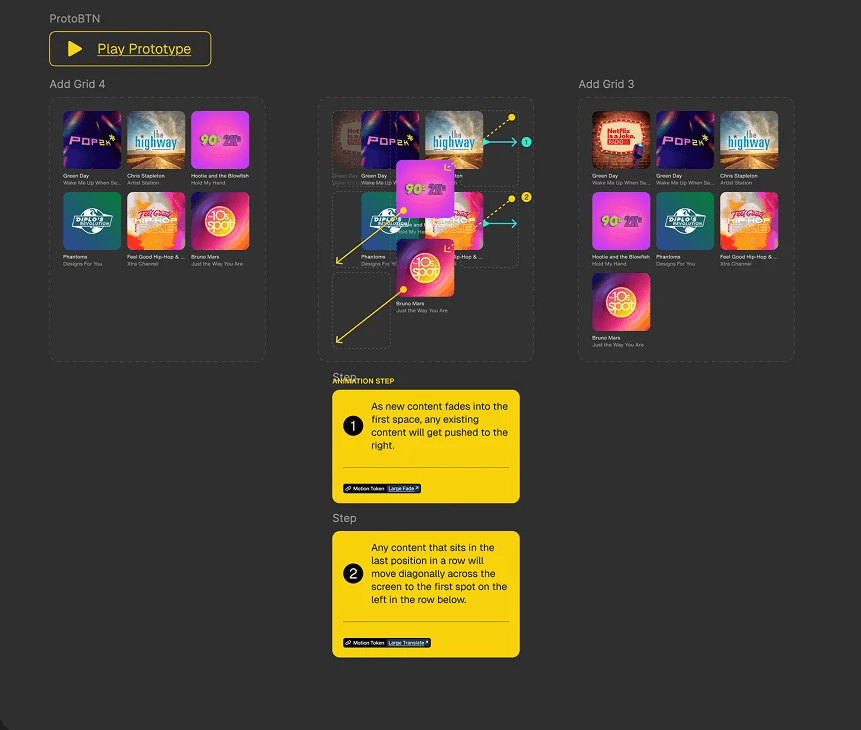
While the feature designers were doing our thing, the design system team was working tirelessly to integrate our new automotive design components with the existing mobile/10 ft design toolkit. They produced a consistent, scalable foundation for our UI through shared design tokens, standardized components, and common assets. This will speed delivery, reduce duplication, and make auto manufacturer-specific customization more manageable.
Click to read more
While the feature designers were doing our thing, the design system team was working tirelessly to integrate our new automotive design components with the existing mobile/10 ft design toolkit. They produced a consistent, scalable foundation for our UI through shared design tokens, standardized components, and common assets. This will speed delivery, reduce duplication, and make auto manufacturer-specific customization more manageable.

Templates
The last design artifacts that we needed to create were the templates themselves. Using the building blocks that were implemented as part of the design system, the templates serve as a comprehensive visual reference of our entire experience. We refer to this as the 'ref client' which is circulated with automotive partners for their consideration as they work with us to create their own vehicle infotainment experiences. Here are some examples:
Click to read more
The last design artifacts that we needed to create were the templates themselves. Using the building blocks that were implemented as part of the design system, the templates serve as a comprehensive visual reference of our entire experience. We refer to this as the 'ref client' which is circulated with automotive partners for their consideration as they work with us to create their own vehicle infotainment experiences. Here are some examples:
Usability Testing
At the same time that the object inventory was being assembled, my half of the team worked on creating wires and flow charts for the processes that would define the majority of the user experience within the current IA. With these we were able to pinpoint weak points in our interactions in addition to collecting open questions for dev and products teams.
Click to read more
In-person testing was conducted using a driving rig simulator along with a head unit that displayed our prototype. Tasks were ranked on a Likert scale of 1-5. Some highlights from the results:
Core features were largely enjoyed
These include the For You page, Favorites, the Channels list, live sports games, and the sidebar on the Now Playing screen.
Higher placement for 'recents' desired
Participants wanted “Recently Played” placed higher on the For You page. Its current position felt buried, making quick selection difficult.
More channel info on detail pages
Participants wanted a clear station overview before extra content, namely what artists play on a channel
Users suggested that the platform could be used to bundle external services
Many use multiple music apps and desired a centralized hub where they could all be accessed together.
'Catalog' tab confused some users
Participants had difficulty
understanding the taxonomical distinction between Radio and Catalog. "On Demand" was suggested as an alternative.
Core features were largely enjoyed
These include the For You page, Favorites, the Channels list, live sports games, and the sidebar on the Now Playing screen.
More channel info on detail pages
Participants wanted a clear station overview before extra content, namely what artists play on a channel
'Catalog' tab confused some users
Participants had difficulty
understanding the taxonomical distinction between Radio and Catalog. "On Demand" was suggested as an alternative.
Higher placement for 'recents' desired
Participants wanted “Recently Played” placed higher on the For You page. Its current position felt buried, making quick selection difficult.
Users suggested that the platform could be used to bundle external services
Many use multiple music apps and desired a centralized hub where they could all be accessed together.
I like this page for validation (the full screen NP) purposes in my mind. It has The Heat logo here, album for context, etc. A lot of these channels are also by DJ's so I can follow along to see what other channels they have.
~Marc
I don't know if there's an opportunity to go through the pages since there's so many channels. A lot of scrolling and my eyes should be on the road.
~Yael
It was easy to find because it had a dedicated comedy section with a laughter indicator. I like the idea of listening to podcasts in the car.
~Kelvin
Conclusion
As of this writing, three major OEMS have committed to our new platform (though I'm not at liberty to say who they are). This is a satisfying win considering the massive amount of time and effort that all of our automotive teams put into making this a reality. Our next steps will be to go through our post-MVP backlog to bring in the features that couldn't make it into the 1.0 release. Excited to see how this project evolves!
As of this writing, three major OEMS have committed to our new platform (though I'm not at liberty to say who they are). This is a satisfying win considering the massive amount of time and effort that all of our automotive teams put into making this a reality. Our next steps will be to go through our post-MVP backlog to bring in the features that couldn't make it into the 1.0 release. Excited to see how this project evolves!
Click to read more
I like this page for validation (the full screen NP) purposes in my mind. It has The Heat logo here, album for context, etc. A lot of these channels are also by DJ's so I can follow along to see what other channels they have.
~Marc
I don't know if there's an opportunity to go through the pages since there's so many channels. A lot of scrolling and my eyes should be on the road.
~Yael
It was easy to find because it had a dedicated comedy section with a laughter indicator. I like the idea of listening to podcasts in the car.