Project type: Mobile-Web UX
Role: Lead UX Designer


Objective
To create a mobile/web design language and reusable component system that would increase our design and development efficiency, acting as a a single source of truth for all UX design related needs.
Accommodate new, key features that will be introduced with our design refresh
Acceptance Criteria
Document
SiriusXM's UX design language and can easily be referenced by multiple departments
Build
A component library that can be used to rapidly construct screens and prototypes
Refine
The visual style of the app design to increase consistency without breaking the existing structures

Information Gathering
To start, we researched existing design systems from entities like Shopify, Lonely Planet, GitHub, Salesforce, and the Government of Canada as well as various literary sources of design system knowledge such as Brad Frost's Atomic Design Principles, Sarah Vesselov's Building Design Systems, and heaping portions of articles on Medium.
Product Inventory

Usability
While deep-diving into the product we were able to pinpoint multiple usability issues that needed to be addressed. A few examples of areas that we focused on:

Contrast and Accessibility
Multiple key components didn't meet WCAG 2 contrast standards. There was also no dark mode dark mode which would offer a higher contrast and further highlight the content tiles.

Application Load Time
This was an issue due to the quantity of large images. Besides the added load time, the imagery lacked distinction (eg. the alt rock station tile was the same color as a country station which drew users to form an association between the two)

Content Differentiation
This has always been a challenge for SiriusXM since they host many different content formats. For example hero promos and video tiles are often confused because both tiles are in a 16:9 aspect ratio.

Content Organization
Since the app loaded with 3 large promo tiles above the fold users believe they were being served ads. They wanted more actionable content that was relevant to them instead of being upsold things they might not enjoy.
Visual Guidelines


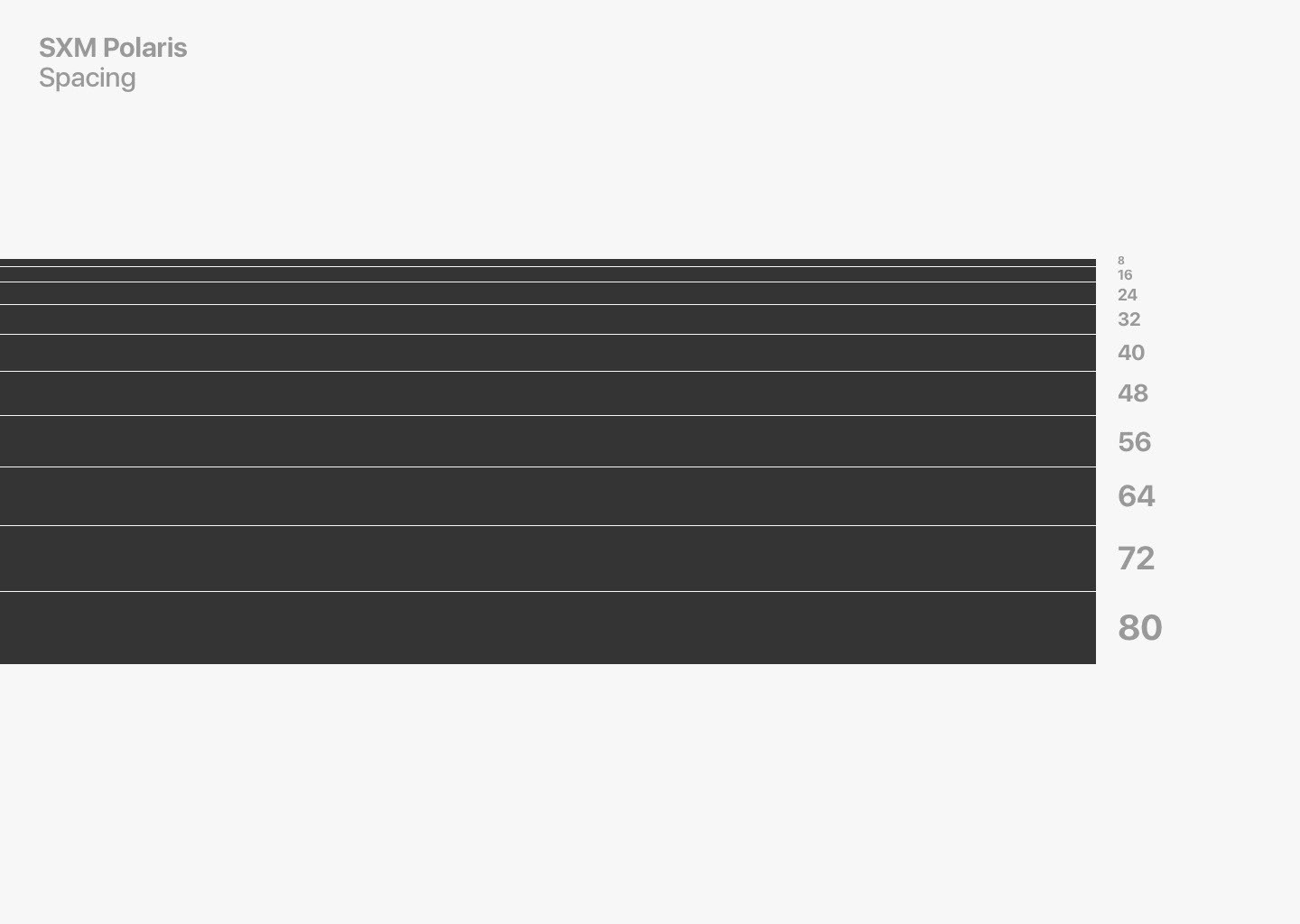

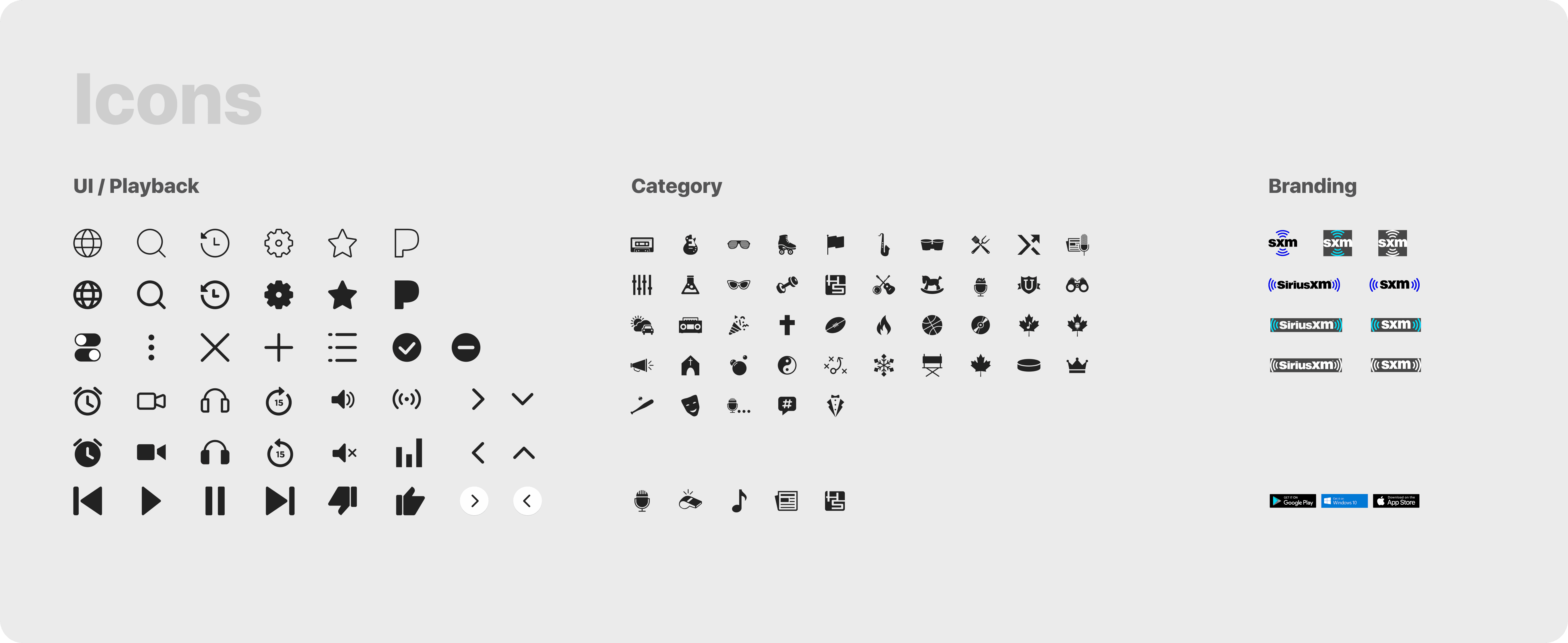
The result was a more consistent look and feel within the UI. We developed a color and spacing system, designed icons with a consistent look/feel, and simplified components such as buttons.

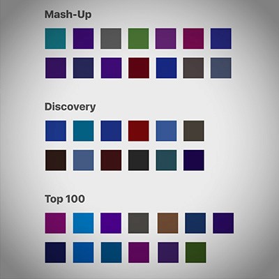
We even took the painstaking task of assigning a unique color to each of SiriusXMs 200+ channels to help celebrate their individual 'sub-brands.' Each color had to be tested in order to meet contrast standards in multiple use cases and due to the wide variance in SiriusXM logo designs this process took a long time to say the least.

Component Design
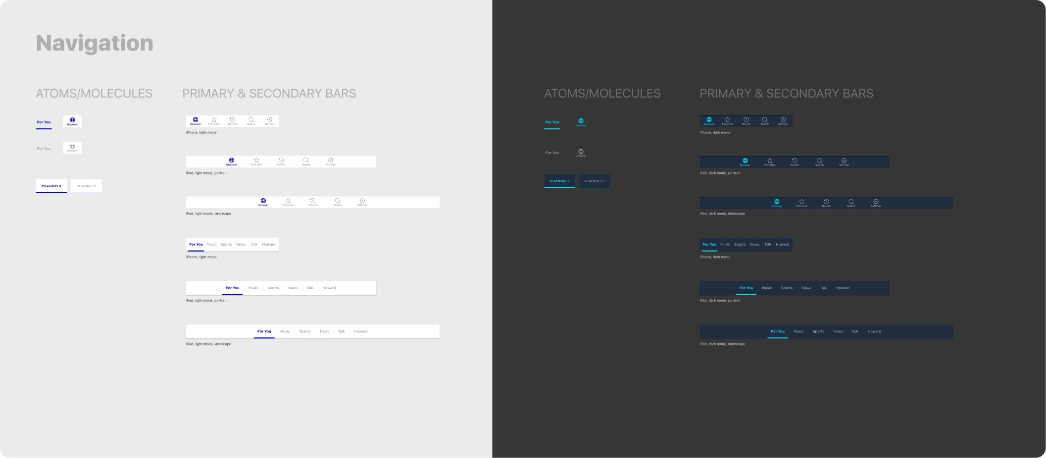
Now the process of building the components begins! With only two designers assigned to this project you can imagine how many hours of work this took, especially when the number of platforms are considered(iOS phone and tablet, Android, AppleTV, FireTV, and in-vehicle). Below are examples of components from the iOS library.


Highlights

Dark Mode
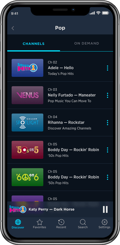
The introduction of dark mode adds a higher contrast UI as well as a greater emphasis on the content tiles
Unique Channel Colors
Every channel has a unique color assigned it it, in lieu of heavy background images

Video Content
Newly added video content design allows for greater distinction from non-video tiles

Pandora Artist Stations
A user can now initiate an artist station from the currently playing artist on a broadcast channel

Sub Genre Channels
In addition to Pandora Stations we launched 100s of sub genre channels related to our most popular channel brands
Screen Assembly
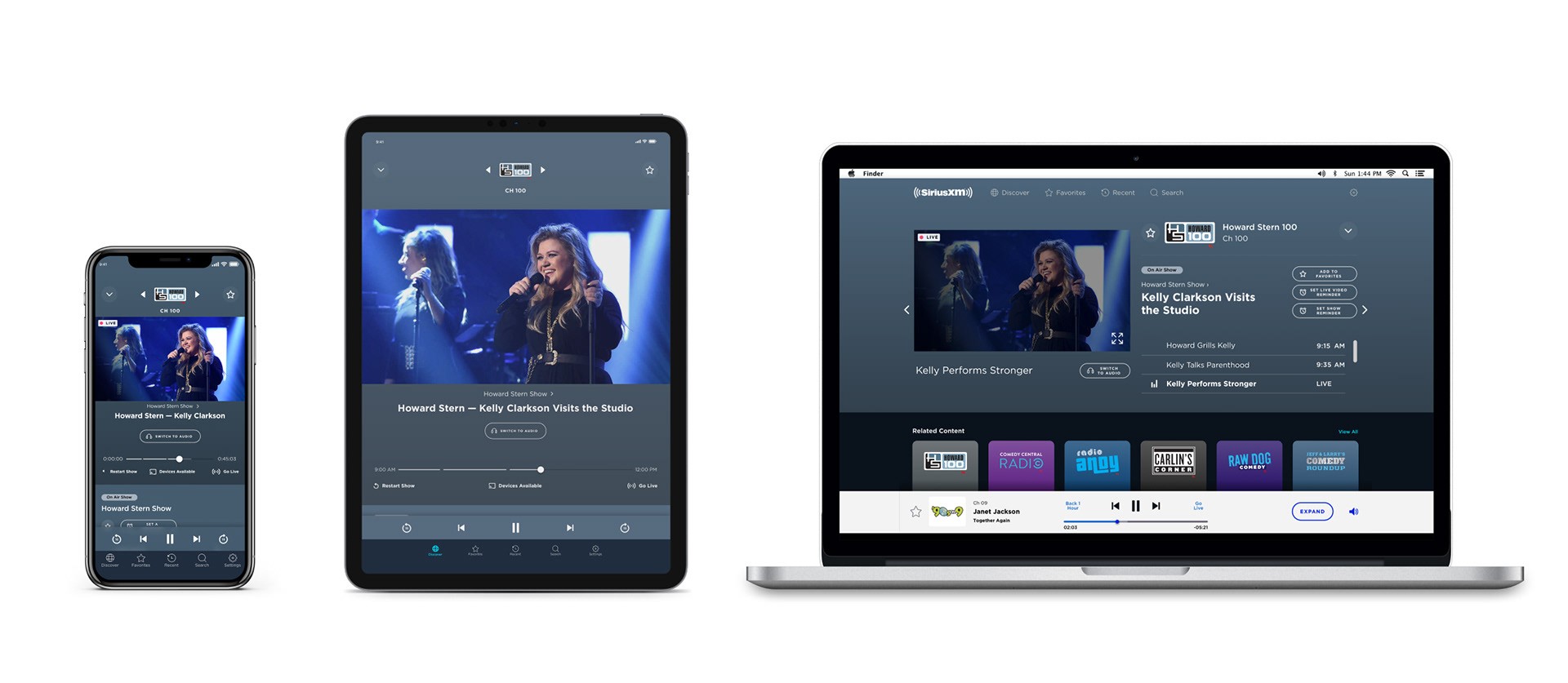

Old vs New


Conclusion
WINS:
1. We built the most comprehensive and consistent component library in our org's history with two people.
2. We received praise from fellow designers with comments such as "cuts mocking up time in half" and "I don't have to look in 12 different files to find the three assets I need."
3. The libraries were not only used by the UX team but also creative services to assist in their mock ups.
4. Through subsequent research, we received a System Usability Score of 85, well above the average of 68.
5. We fixed accessibility in a number of areas, especially on the main button components which, in the previous app iteration, had failed contrast ratio standards.
6. Removing unnecessary images (eg. the previous tile backgrounds were very image heavy) reduced load time.
7. Dark mode was implemented.
8. The app shipped!
LOSSES:
1. Although we were able to implement some features that we were excited about, the fact that this wasn't considered a full redesign by the top brass means that we couldn't secure the development resources to implement features like: metadata outside the tile space, default images as fallbacks for no artwork, album art dominant colors in now playing background, and additional onboarding features to explain things like Pandora Stations and Xtra Channels.
2. Although our SUS score was above average it was lower than our previous app iteration. According to the research conducted the addition of features like Pandora Stations without much onboarding confused some users and dragged the score down.
3. The brand guidelines that we needed in order to create our own visual UI guides were created in a silo where app design was not considered. We ended up having to bend a lot of brand standards to make them work in what we were creating.
4. After a corporate re-org I was placed on a different team and no one was given the stewardship of the design system. It was in use for about 5 months at that point.
5. Lack of QA resources was a let down
6. The goal of writing thorough usage guidelines didn't pan out due to lack of resources
We set out to create a tool that would not only save our designers time but could act as a conduit, communicating across different teams the building blocks that make up a SiriusXM product. To some extent we accomplished those goals, especially with only two designers on the project. Our designers praised it and, to this day (Feb 2021), a good portion of it is reflected in the current in-market SiriusXM app. That being said, it takes a commitment beyond 2-3 people to make something like this really stick; good design needs to be in the organization's DNA. And good design is the product of good communication, whether it's with users or fellow designers. So did we fully break down the silos that kept us from achieving app design utopia? No. But we definitely poked a few holes to let some sun shine in.
